Analysis of Population Structure: Microsatellites vs. ddRADseq
by Paul Maier
4/3/2017
In this tutorial we will be working with the Yosemite Toad, which is found in the central Sierra Nevada mountains of eastern California. The distribution of Yosemite Toads overlaps with two national parks, Yosemite and Kings Canyon. The genomic datasets in this tutorial come from the overlap between toads and Kings Canyon National Park, a small area of approximately 20 x 20 miles.
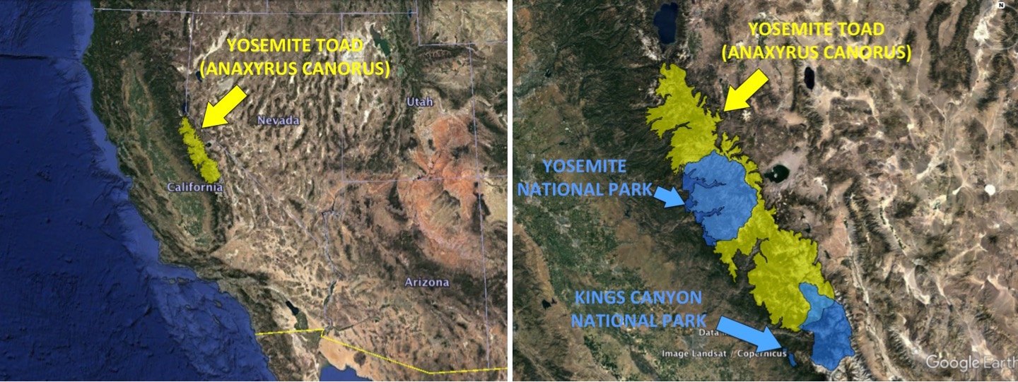
Our goal is to compare the power of two types of genetic dataset: (1) A small microsatellite dataset typical of most population genetic studies until recently. There are 7 loci with 2-13 alleles per locus (median = 10), and a high mutation rate. (2) A ddRADseq based on library preparation and sequencing technologies that are quickly becoming affordable for many labs. It is filtered to have 1918 loci with 1-5 haplotypes per locus (median = 2), but has a lower mutation rate. We will test the abilities of these two datasets to differentiate between populations (physically separated breeding sites) and estimate genetic structure with precision and accuracy.
1. Set Up Shop: Install, Load, Prepare Data
Clean up your global environment first. Remove all R objects and start with a clean slate.
rm(list=ls())Set your working directory and apply global settings. In this case we want to save our initial import settings and graphical parameters for later, when we change them.
setwd("~/Desktop/Tutorial/")
options(stringsAsFactors = F)
Source the “behind-the-scenes” functions that are used for in this tutorial.
source("./Rscripts/624functions.R")Unload currently loaded libraries to clear the memory and start fresh.
invisible(unloadPackages(.packages()))Load all libraries used in this tutorial.
libraries <- c("poppr", "adegenet", "spaa", "igraph", "metap", "plyr", "reshape2", "dplyr", "sp", "rgdal", "pegas", "lattice", "dismo", "ggplot2", "diveRsity", "assigner", "tess3r", "gstudio", "progress", "ggmap", "plotrix", "gridExtra", "hierfstat", "RColorBrewer", "grid", "knitr")
sapply(libraries, function(x) { suppressMessages(require(x, character.only=T)) } )
## Warning: S3 method 'as.data.frame.genetic_structure' was declared in
## NAMESPACE but not found## poppr adegenet spaa igraph metap
## TRUE TRUE TRUE TRUE TRUE
## plyr reshape2 dplyr sp rgdal
## TRUE TRUE TRUE TRUE TRUE
## pegas lattice dismo ggplot2 diveRsity
## TRUE TRUE TRUE TRUE TRUE
## assigner tess3r gstudio progress ggmap
## TRUE TRUE TRUE TRUE TRUE
## plotrix gridExtra hierfstat RColorBrewer grid
## TRUE TRUE TRUE TRUE TRUE
## knitr
## TRUEImport all files needed for this tutorial. These include a shapefile (Kings Canyon National Park), the lat/long of all points for which we have microsatellite and ddRADseq data, and the actual microsatellite and ddRADseq data.
data.file.1 <- "./Data/data_ms_kings.stru"
data.file.2 <- "./Data/data_radhap_kings.stru"
data.files <- c(data.file.1, data.file.2)
coordfile <- "./GIS/coords_mdw.txt"
kingsbndry <- readOGR(dsn = "./GIS", layer = "Kingsbndry")
2. Summary Stats: Microsatellites vs. ddRADseq
Read in the microsatellite data, after counting the number of individuals and loci.
n.ind.1 <- dim(read.table(data.file.1, skip=1)[,-c(1:2)])[1]/2
n.loc.1 <- dim(read.table(data.file.1, skip=1)[,-c(1:2)])[2]
gi1 <- read.structure(data.file.1, n.ind=n.ind.1, n.loc=n.loc.1, col.lab=1, col.pop=2, onerowperind=F, col.others=0, row.marknames=1, NA.char=-9)
##
## Converting data from a STRUCTURE .stru file to a genind object...Next, assemble a table of diversity statistics. Most of these are generated from the poppr package which has several tutorials, vignettes (also see this one for in-depth definitions of the indices below), and manuals. Below is a table summarizing the stats you will calculate. This table is heavily borrowed from poppr’s tutorial on genotypic richness, diversity, and evenness, which you should check out here. Estimates of expected heterozygosity (\(\sf{H_{O}}\)), gene diversity (\(\sf{H_{S}}\)), and inbreeding coefficient (\(\sf{F_{IS}}\)) are calculated using adegenet.
| Abbreviation | Definition |
|---|---|
| N | No. of individuals |
| MLG | No. of multi-locus genotypes |
| eMLG | Expected no. of MLG at the smallest sample size (≥ 10) based on rarefaction |
| SE | Standard error for eMLG |
| H | Shannon-Weiner Diversity index of MLG diversity (Shannon, 2001) |
| G | Stoddard and Taylor’s index of MLG diversity (Stoddart & Taylor, 1988) |
| lambda | Simpson’s index of diversity (Simpson, 1949) |
| E.5 | Evenness, \(\sf{E_{5}}\) (Pielou, 1975; Ludwig & Reynolds, 1988; Grünwald et al., 2003) |
| Ia | Index of Association, \(\sf{I_{A}}\) (Brown, Feldman & Nevo, 1980; Smith et al., 1993) |
| p.Ia | P-value for \(\sf{I_{A}}\) from 100 reshufflings |
| rbarD | Standardized Index of Association, \(\sf{r_{d}}\) (Agapow & Burt, 2001) |
| p.rD | P-value for \(\sf{r_{d}}\) from 100 permutations |
| Ho | Observed heterozygosity, \(\sf{H_{O}}\) |
| Hs | Nei’s unbiased gene diversity, \(\sf{H_{S}}\) (Nei, 1987) |
| Fis | Individual fixation index (inbreeding coefficient), \(\sf{F_{IS}}\) (Nei, 1987) |
| PA | No. of private alleles |
div <- poppr(gi1, sample=100, plot=F)
div <- div[,!names(div)%in%c("File","Hexp")]
Ho <- colMeans(basic.stats(gi1)$Ho, na.rm=T)
Hs <- colMeans(basic.stats(gi1)$Hs, na.rm=T)
Fis <- colMeans(basic.stats(gi1)$Fis, na.rm=T)
div2 <- data.frame(Ho=Ho, Hs=Hs, Fis=Fis)
tots <- colMeans(div2)
div2 <- rbind(div2, tots)
div <- cbind(div, div2)
PA <- rowSums(private_alleles(gi1, count.alleles=F))
PA <- data.frame(PA)
PA <- rbind(PA, Total=colSums(PA))
div <- cbind(div, PA)
row.names(div) <- NULL
is.num <- sapply(div, is.numeric)
div[is.num] <- lapply(div[is.num], round, 3)
print(div)| Pop | N | MLG | eMLG | SE | H | G | lambda | E.5 | Ia | p.Ia | rbarD | p.rD | Ho | Hs | Fis | PA |
|---|---|---|---|---|---|---|---|---|---|---|---|---|---|---|---|---|
| 101 | 20 | 20 | 20.000 | 0.000 | 2.996 | 20.000 | 0.950 | 1.000 | 0.333 | 0.505 | 0.068 | 0.505 | 0.459 | 0.551 | 0.250 | 0 |
| 1071 | 30 | 30 | 20.000 | 0.000 | 3.401 | 30.000 | 0.967 | 1.000 | 0.570 | 0.010 | 0.097 | 0.010 | 0.674 | 0.689 | 0.034 | 0 |
| 1131 | 41 | 41 | 20.000 | 0.000 | 3.714 | 41.000 | 0.976 | 1.000 | 0.429 | 0.228 | 0.073 | 0.228 | 0.516 | 0.711 | 0.305 | 0 |
| 1138 | 29 | 29 | 20.000 | 0.000 | 3.367 | 29.000 | 0.966 | 1.000 | 0.306 | 0.010 | 0.052 | 0.010 | 0.632 | 0.732 | 0.152 | 1 |
| 1141 | 30 | 29 | 19.563 | 0.496 | 3.355 | 28.125 | 0.964 | 0.981 | 0.848 | 0.010 | 0.144 | 0.010 | 0.538 | 0.671 | 0.260 | 0 |
| 1165 | 30 | 30 | 20.000 | 0.000 | 3.401 | 30.000 | 0.967 | 1.000 | 0.290 | 0.347 | 0.049 | 0.317 | 0.588 | 0.638 | 0.080 | 0 |
| 1179 | 30 | 30 | 20.000 | 0.000 | 3.401 | 30.000 | 0.967 | 1.000 | 0.032 | 0.515 | 0.005 | 0.505 | 0.599 | 0.700 | 0.178 | 0 |
| 1381 | 30 | 30 | 20.000 | 0.000 | 3.401 | 30.000 | 0.967 | 1.000 | -0.079 | 0.713 | -0.020 | 0.733 | 0.402 | 0.469 | 0.257 | 0 |
| 24 | 40 | 40 | 20.000 | 0.000 | 3.689 | 40.000 | 0.975 | 1.000 | 0.350 | 0.921 | 0.060 | 0.921 | 0.609 | 0.717 | 0.208 | 1 |
| 902 | 29 | 16 | 12.446 | 1.202 | 2.530 | 9.894 | 0.899 | 0.770 | 0.207 | 0.059 | 0.070 | 0.079 | 0.260 | 0.216 | 0.046 | 0 |
| 916 | 29 | 25 | 18.128 | 0.903 | 3.176 | 22.730 | 0.956 | 0.947 | 0.454 | 0.059 | 0.081 | 0.059 | 0.645 | 0.525 | -0.249 | 0 |
| 958 | 29 | 28 | 19.532 | 0.499 | 3.319 | 27.129 | 0.963 | 0.981 | 0.240 | 0.139 | 0.062 | 0.119 | 0.655 | 0.493 | -0.330 | 2 |
| Total | 367 | 348 | 19.907 | 0.311 | 5.817 | 309.630 | 0.997 | 0.922 | 0.393 | 0.010 | 0.066 | 0.010 | 0.548 | 0.593 | 0.099 | 4 |
Now, repeat this process for the ddRADseq dataset.
| Pop | N | MLG | eMLG | SE | H | G | lambda | E.5 | Ia | p.Ia | rbarD | p.rD | Ho | Hs | Fis | PA |
|---|---|---|---|---|---|---|---|---|---|---|---|---|---|---|---|---|
| 101 | 6 | 6 | 6 | 0 | 1.792 | 6 | 0.833 | 1 | 44.886 | 0.010 | 0.057 | 0.01 | 0.229 | 0.212 | -0.076 | 0 |
| 1071 | 10 | 10 | 10 | 0 | 2.303 | 10 | 0.900 | 1 | 55.484 | 0.010 | 0.043 | 0.01 | 0.287 | 0.283 | -0.007 | 0 |
| 1131 | 7 | 7 | 7 | 0 | 1.946 | 7 | 0.857 | 1 | 3.348 | 0.030 | 0.003 | 0.03 | 0.275 | 0.290 | 0.033 | 0 |
| 1138 | 10 | 10 | 10 | 0 | 2.303 | 10 | 0.900 | 1 | 19.648 | 0.010 | 0.015 | 0.01 | 0.286 | 0.289 | 0.007 | 1 |
| 1141 | 7 | 7 | 7 | 0 | 1.946 | 7 | 0.857 | 1 | 33.596 | 0.010 | 0.029 | 0.01 | 0.276 | 0.281 | 0.009 | 0 |
| 1165 | 7 | 7 | 7 | 0 | 1.946 | 7 | 0.857 | 1 | 46.592 | 0.059 | 0.052 | 0.05 | 0.281 | 0.254 | -0.092 | 0 |
| 1179 | 10 | 10 | 10 | 0 | 2.303 | 10 | 0.900 | 1 | 20.011 | 0.010 | 0.015 | 0.01 | 0.290 | 0.285 | -0.009 | 0 |
| 1381 | 6 | 6 | 6 | 0 | 1.792 | 6 | 0.833 | 1 | 31.836 | 0.010 | 0.043 | 0.01 | 0.232 | 0.205 | -0.140 | 0 |
| 24 | 10 | 10 | 10 | 0 | 2.303 | 10 | 0.900 | 1 | 9.097 | 0.010 | 0.007 | 0.01 | 0.297 | 0.294 | -0.005 | 0 |
| 902 | 4 | 4 | 4 | 0 | 1.386 | 4 | 0.750 | 1 | 23.376 | 0.010 | 0.047 | 0.01 | 0.180 | 0.158 | -0.161 | 0 |
| 916 | 22 | 22 | 10 | 0 | 3.091 | 22 | 0.955 | 1 | 46.188 | 0.010 | 0.039 | 0.01 | 0.251 | 0.243 | -0.024 | 13 |
| 958 | 10 | 10 | 10 | 0 | 2.303 | 10 | 0.900 | 1 | 38.289 | 0.010 | 0.039 | 0.01 | 0.250 | 0.227 | -0.086 | 0 |
| Total | 109 | 109 | 10 | 0 | 4.691 | 109 | 0.991 | 1 | 19.747 | 0.010 | 0.013 | 0.01 | 0.261 | 0.252 | -0.046 | 14 |
3. Delineating Populations with Microsatellites vs. ddRADseq
3.1. Contingency Table (RxC) Method
Let’s compare and contrast two datasets collected in 2011 from the same locations. These are Yosemite Toad meadows in Kings Canyon National Park. We will use our own implementation of Raymond & Rousset’s (1995) exact test method for detecting population differentiation. The method compares each pair of putative populations and, locus by locus, analyzes whether the counts of alleles are significantly different. We implement their method here using fisher’s exact test on contingency tables. The null hypothesis is that row and column variables are independent of each other, meaning the count of each allele does not depend on which population it’s found in. In the following hypothetical example, the expected number of ‘A’ alleles in Pop 1 is 10 (20 ‘A’ alleles * 50 Pop 1 gene copies / 100), but there are 0.
| Allele A | Allele B | Allele C | Allele D | Allele E | Total | |
|---|---|---|---|---|---|---|
| Pop 1 | 0 | 6 | 9 | 16 | 19 | 50 |
| Pop 2 | 20 | 14 | 11 | 4 | 1 | 50 |
| Total | 20 | 20 | 20 | 20 | 20 | 100 |
In this way, a chi-square test could be done using the observed and expected cell values (e.g. 0 and 10), but Fisher (1935) computed an exact test of the Type I error probabilities for any contingency table. It’s computed by summing the probabilities of all tables with the same RxC dimensions, with the same or lesser probability as the observed table. Since there is a huge number of such tables, we instead use MCMC to explore the “table space” and compute an unbiased p-value. Then we use Fisher’s combined probability test (Fisher 1970 in Manly 1985) to create one multilocus probability, and finally correct the p-value for multiple population tests.
Our implementation provides some flexibility, so let’s first set some of the options for running an RxC analysis. Set the number of reps used in the MCMC for calculating fisher’s exact test p-values. This should ideally be around 100,000 or higher, but for speed of this tutorial we will use 100.
numMCMC <- 100Choose the type of correction for multiple exact tests. The options are: holm, hochberg, hommel, bonferroni, BH, BY, fdr, and none. Here we will use Benjamini & Hochberg’s (1995) false discovery rate or “FDR” method. Details about these methods of adjusting p-values can be found using ?p.adjust.
correction <- "fdr"Now let’s filter some of our loci.
For starters, how many of our loci are in Hardy-Weinberg equilibrium? We can perform tests of HWE assumptions for each locus:
(hwe <- hw.test(gi1.rxc, B=0))## chi^2 df Pr(chi^2 >)
## bbr17 612.89563 6 0.000000e+00
## bbr4-2 28.01605 1 1.203134e-07
## bbr36 316.71899 45 0.000000e+00
## bbr4 81.05874 45 7.861330e-04
## bbr293 164.24981 21 0.000000e+00
## bbr34-2 239.84425 55 0.000000e+00
## bbr87b 310.13533 78 0.000000e+00It might look like none of our loci are in HWE, however we failed to take into account population structure. Let’s retry this test for each population separately (here are just the first 2 pops, to save on space):
hwe.pop <- seppop(gi1.rxc) %>% lapply(hw.test, B = 0)
head(hwe.pop, 2)
## $`101`
## chi^2 df Pr(chi^2 >)
## bbr17 18.00000000 1 0.0000220905
## bbr4-2 0.01469388 1 0.9035181255
## bbr36 16.77083333 6 0.0101634113
## bbr4 3.38888889 3 0.3354613395
## bbr293 NA NA NA
## bbr34-2 11.47685950 10 0.3215916780
## bbr87b 7.66055556 6 0.2640413068
##
## $`1071`
## chi^2 df Pr(chi^2 >)
## bbr17 48.713436 6 8.508299e-09
## bbr4-2 0.415453 1 5.192147e-01
## bbr36 58.371795 28 6.546703e-04
## bbr4 8.631893 15 8.959650e-01
## bbr293 18.567435 10 4.611361e-02
## bbr34-2 77.009462 36 8.309418e-05
## bbr87b 55.180952 21 6.652429e-05We could look at the list of p-values by locus and population, or simply view a heatmap of significant/insignificant values. The following plot shows us loci in rows, and populations in columns. Note, that all loci shown in pink are loci suspected of not being in HWE with p ≤ 0.05. These pink loci will not be considered at these particular populations:
hwe.pop.p <- sapply(hwe.pop, "[", i = TRUE, j = 3)
hwe.pop.p[hwe.pop.p > 0.05] <- 1
levelplot(t(hwe.pop.p), aspect="fill", xlab="Population", ylab="Locus")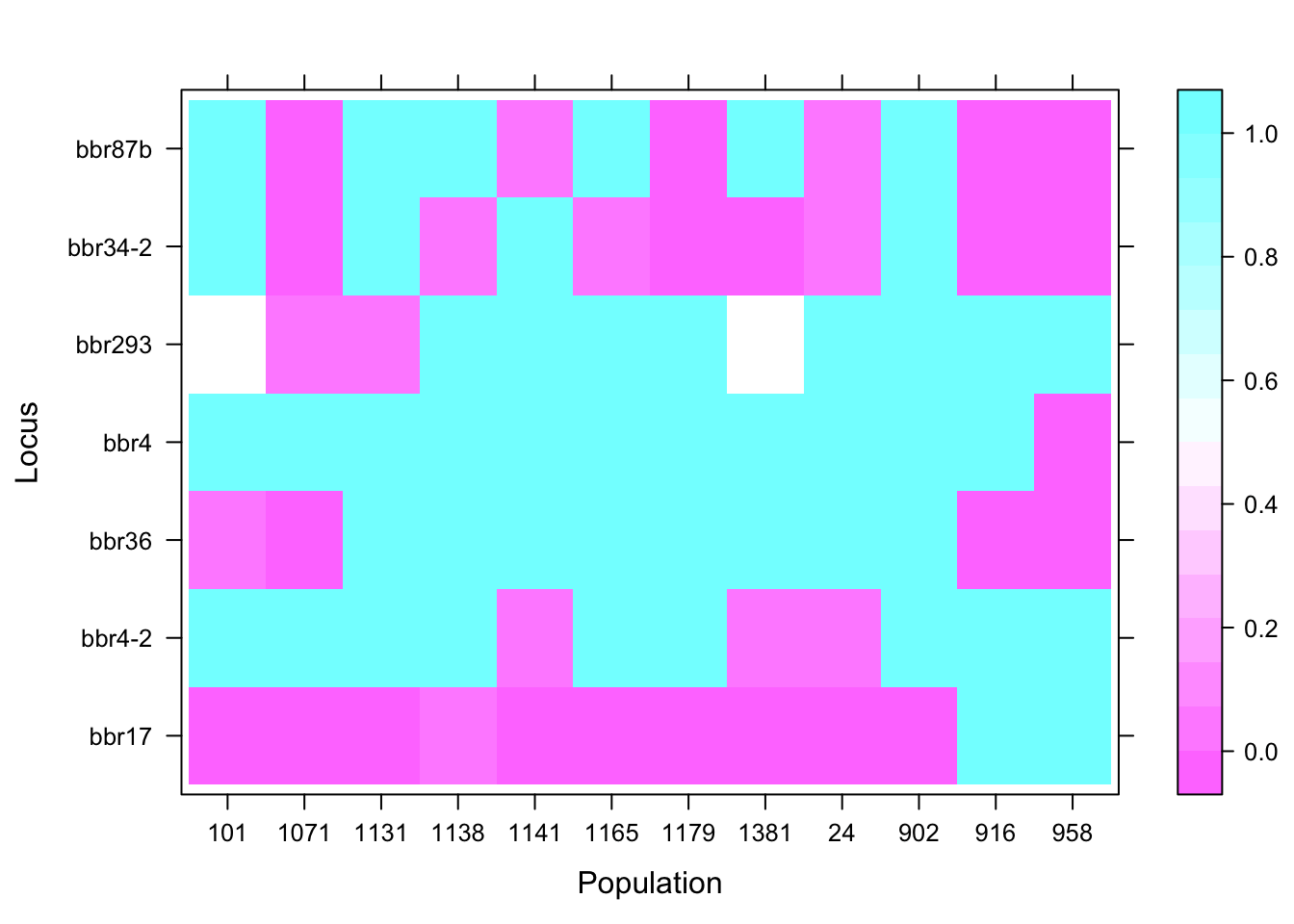
Now we can filter our loci in several ways:
1. We can set our list of black loci by including them in the “black_loci” vector. Black loci are those which should be excluded for some reason, but we will include all loci in this dataset.
2. When comparing two populations, we can skip loci with ANY missing individuals by setting “rem_loci” to TRUE. This would be pretty stringent and we will set this to FALSE.
3. We can remove alleles at less than a certain frequency, since low frequency alleles can have low power for differentiation. We will set this to 0 to disable this feature.
4. The data might have monomorphic loci, so we will remove these if present.
5. We can replace NA values with the median allele for that locus, to lessen the effect of missing data on erroneously detecting population subdivision. Assuming there is no ascertainment bias by population, this might not matter. We will set this to FALSE.
6. Finally, we can remove comparisons between populations at loci that are out of Hardy Weinberg equilibrium. We will set that to TRUE.
black_loci <- c()
rem_loci <- FALSE
lowfreq <- 0
if ( lowfreq != 0 ) { gi1.rxc <- lowfreq.f(gi1.rxc, lowfreq) }
gi1.rxc <- mono.f(gi1.rxc)
NAreplace <- FALSE
if (NAreplace == TRUE) { gi1.rxc <- NAreplace.f(gi1.rxc) }
hwe_remove <- TRUE
Our microsatellite dataset has populations of larger sample size than our ddRADseq dataset:
table(pop(gi1.rxc))##
## 101 1071 1131 1138 1141 1165 1179 1381 24 902 916 958
## 20 30 41 29 30 30 30 30 40 29 29 29table(pop(gi2.rxc))##
## 101 1071 1131 1138 1141 1165 1179 1381 24 902 916 958
## 6 10 7 10 7 7 10 6 10 4 22 10So we should set a maximum population sample size; if our sample is larger, this will automatically sample n random individuals. We will set this to 10 to keep our sample sizes among datasets relatively equal. Set this to 0 to disable.
maxsize <- 10
if (maxsize != 0) { gi1.rxc <- maxsize.f(gi1.rxc, maxsize) }
Now let’s create a data frame of population by allele, with counts of each allele and counts of individuals per population
data <- data.frame(pop=gi1.rxc@pop, row.names(gi1.rxc@tab), gi1.rxc@tab)
datapop <- ddply(data, "pop", numcolwise(sum,na.rm=T))
counts <- as.data.frame(data %>% group_by(pop) %>% summarise(no_rows = length(pop)))
We are finally set to conduct fisher’s exact tests on pairwise contingency tables, for each population by locus comparision.
diff <- data.frame(pop1=character(0), pop2=character(0), p=character(0))
w <- c() # Get list of all locus lengths (number of alleles)
for (i in 1:length(gi1.rxc@all.names)) { w <- c(w, length(gi1.rxc@all.names[[i]])) }
plotdiff <- RxC(diff, w, gi1.rxc, rem_loci, black_loci, hwe_remove)
We need to correct the combined p-values for number of tests performed, then convert the p-values into a matrix, and finally convert the matrix into an adjacency matrix, from which we can create an igraph object for visualization.
plotdiff[,3] <- as.numeric(p.adjust(plotdiff[,3], method = correction))
plotdiff[which(plotdiff[,3] < 0.05),3] <- 0
plotdiff[which(plotdiff[,3] >= 0.05),3] <- 1
plotdiff <- list2dist(plotdiff)
plotdiff <- as.matrix(plotdiff)
graph <- simplify(graph.adjacency(plotdiff, weighted=T, mode ='undirected'))
Now that we have our igraph object, where populations with insignificant population differentation are connected, we need to consider pruning populations that don’t have enough data.
1. We can set the minimum proportion of loci for a population to have with “loci_min”, in order to consider use it for calculations. All datasets already have > 0.75 of loci, so we will set this to 0 to disable this feature.
2. We can also remove additional populations of our choosing, by including them in the “delete_too” vector. We will not do so here.
3. Finally, we can set the minimum pop size, since smaller values in contingency tables have less power to detect an effect. We set that to 4.
loci_min <- 0
delete_too <- c()
minsize <- 4
pop_few_loci <- pop_few_loci.f(loci_min)
graph.and.minsize <- minsize.f(counts, minsize, delete_too, pop_few_loci, graph)
graph <- graph.and.minsize[[1]]
delsmall <- graph.and.minsize[[2]]
We can use the following function to display igraph’s regular plot, but this will not show populations across geographic space.
plot(graph, vertex.color="lightsteelblue2", edge.color="red",
     vertex.size=25, main="Network of Undifferentiated Meadows")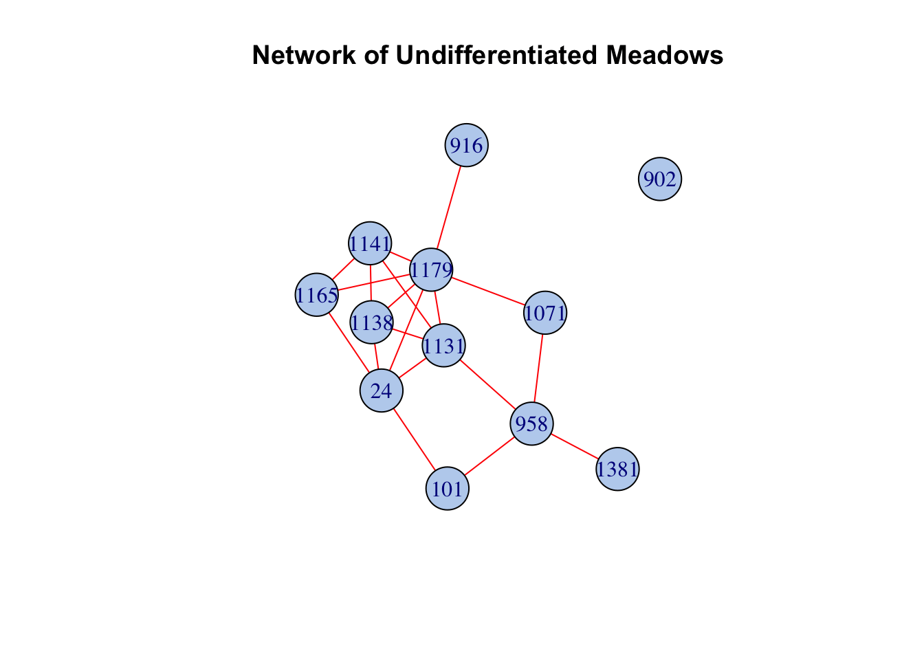
Let’s use our own custom plotting function to show differentiation (or lack thereof) between Yosemite Toad populations in Kings Canyon. The inset shows the Martha Lake area, where sampled populations are close together. 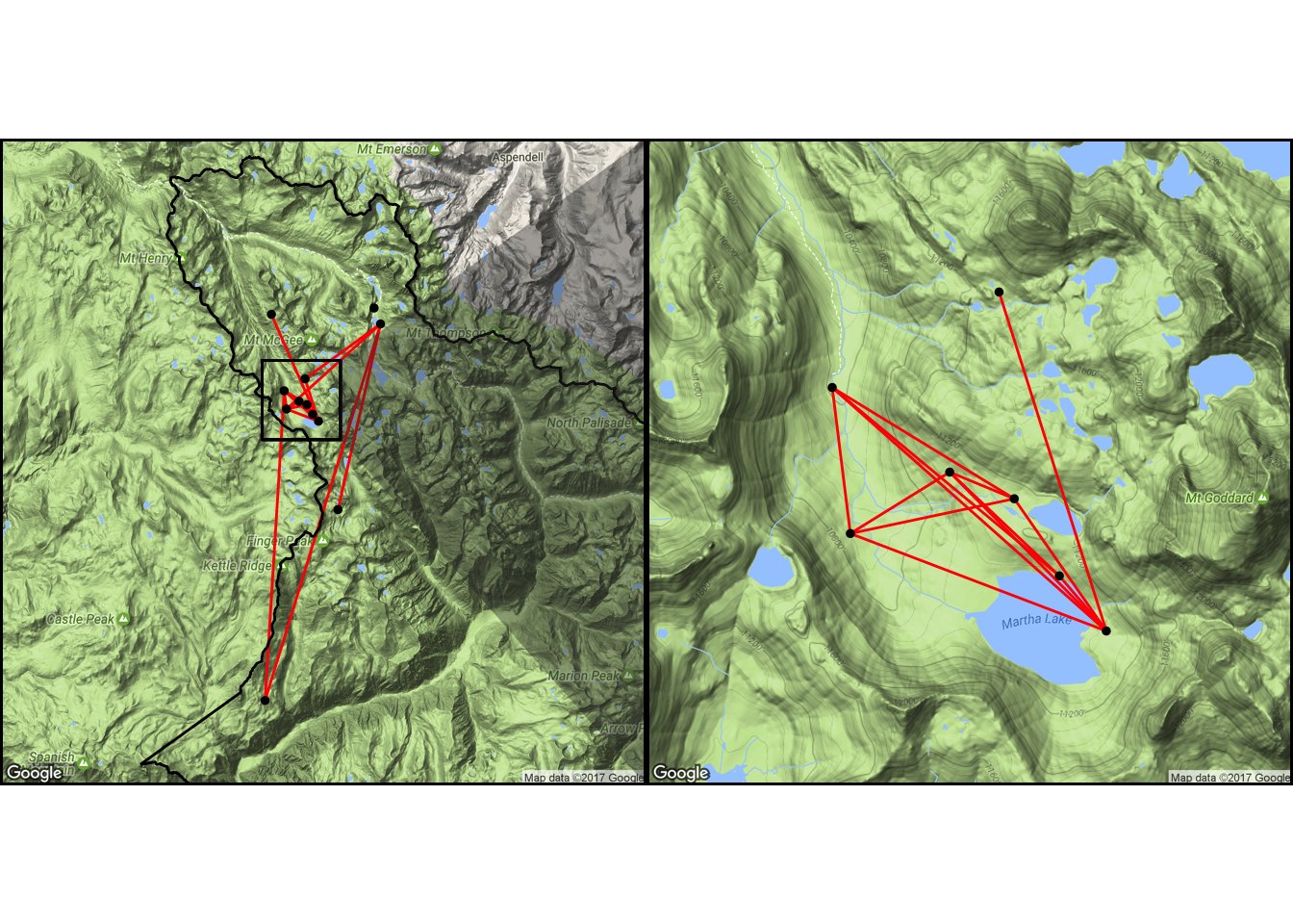
Now let’s repeat all steps for the ddRADseq dataset. Here is our HWE table overall, by locus (there are thousands, here are just the first 10):
##              chi^2 df  Pr(chi^2 >)
## I100105  1.7973891  1 1.800285e-01
## I10040   0.0000000  0 1.000000e+00
## I102809  0.3349963  1 5.627318e-01
## I1029   16.1644604  1 5.807352e-05
## I105042  0.0000000  0 1.000000e+00
## I10625  11.1957893  1 8.198316e-04
## I1126    0.2293615  1 6.319977e-01
## I113139  0.0000000  0 1.000000e+00
## I11417   9.1207111  1 2.527317e-03
## I119939  0.0000000  0 1.000000e+00
And our HWE table by population (for just the first 10 loci, and 2 pops):
## $`101`
##               chi^2 df Pr(chi^2 >)
## I100105 0.000000000  0   1.0000000
## I10040  0.000000000  0   1.0000000
## I102809 0.049586777  1   0.8237839
## I1029   0.000000000  0   1.0000000
## I105042 0.000000000  0   1.0000000
## I10625  0.000000000  0   1.0000000
## I1126   0.666666667  1   0.4142162
## I113139 0.000000000  0   1.0000000
## I11417  0.004897959  1   0.9442053
## I119939 0.000000000  0   1.0000000
##
## $`1071`
##         chi^2 df Pr(chi^2 >)
## I100105   0.0  0  1.00000000
## I10040    0.0  0  1.00000000
## I102809   0.0  0  1.00000000
## I1029     0.0  0  1.00000000
## I105042   0.0  0  1.00000000
## I10625    0.0  0  1.00000000
## I1126     3.6  1  0.05777957
## I113139   0.0  0  1.00000000
## I11417    0.0  0  1.00000000
## I119939   0.0  0  1.00000000
Here’s the heatmap of HWE, locus x population: 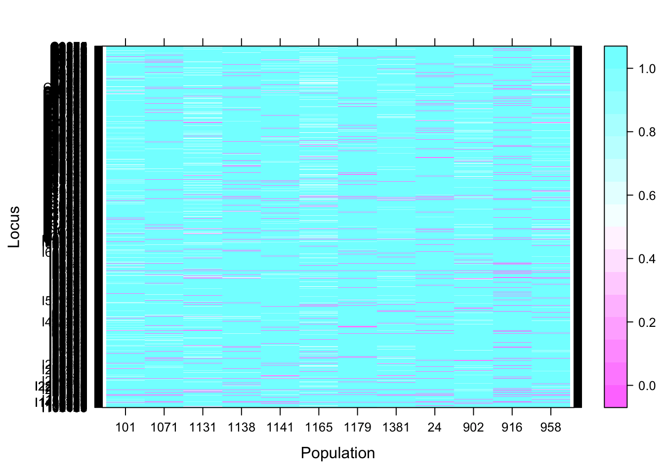
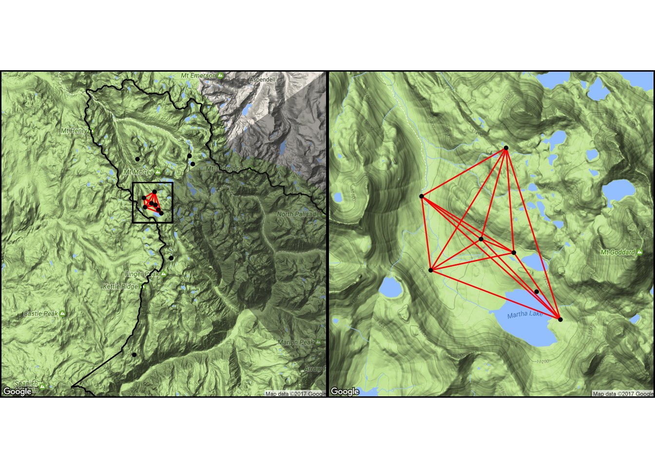
And the overall RxC-generated map of population differentiation: 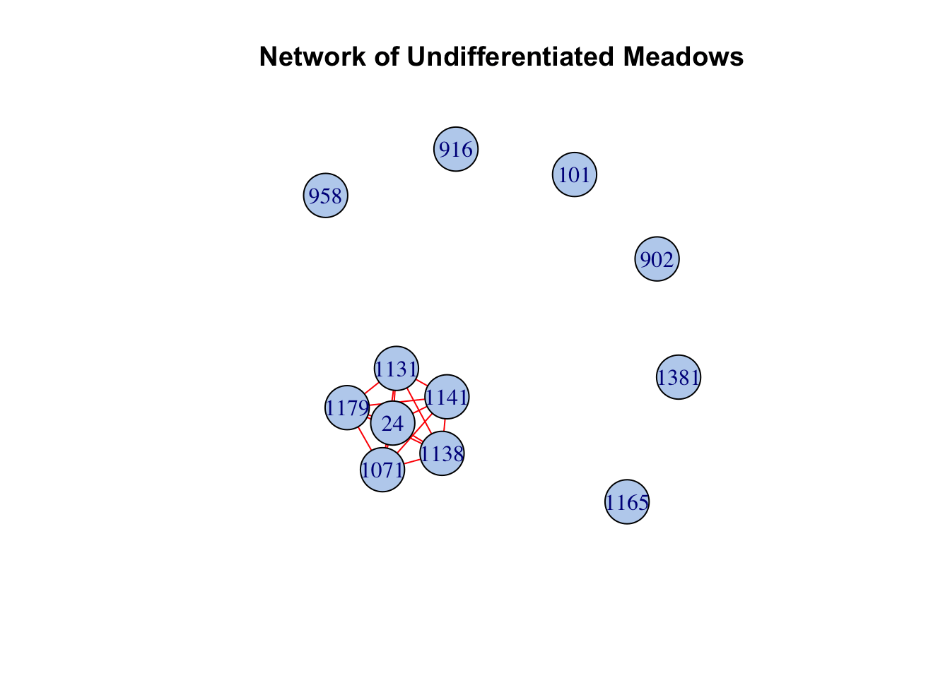
3.2. Clustering Analysis with TESS3
Bayesian genetic clustering algorithms are widely used to delineate population boundaries without preconceived notions about where those boundaries might be. They assign individuals or fractions of individual genomes to ancestral gene pools based on multilocus genotypes. The models for these programs assume the K specified ancestral gene pools are idealized populations, meaning their algorithms try to find a result that minimizes Hardy-Weinberg and linkage disequilibrium. Usually, they estimate admixture coefficients for each gene pool using Markov Chain Monte Carlo (MCMC) methods. STRUCTURE is one of the most popular and successful, but many others are used, including GENECLUST, PARTITION, and BAPS. Other programs also include spatial coordinates into their prior distributions because isolation by distance likely structures allele frequencies, and these include GENELAND, GENECLUST, and TESS. TESS in particular performs better than non-spatial methods at low levels of population divergence. Here we use a new version of TESS called TESS3 (implemented in R: “tess3r” that drops the MCMC and instead uses least-squares optimization and geographically constrained non-negative matrix factorization. This faster algorithm, akin to the ones used in ADMIXTURE and sNMF, is a likelihood algorithm with comparable accuracy and much faster run times.
First, let’s read in a tab-delimited format of the data, and emove all 2012 data (because this is absent from the 2011 microsatellite dataset).
data <- read.delim(data.file.1, header=T)
names(data)[1:2] <- c("ind","pop")
coords <- read.table(coordfile, header=T, row.names=1)
coords <- data.frame(pop=row.names(coords), coords)
data <- merge(coords, data, by="pop")
data <- data[order(data$ind),]
data <- data.frame(ind=data$ind, pop=data$pop, Longitude=data$Long,
                   Latitude=data$Lat, data[,-c(1:4)])
rem <- which(data$ind %in% data$ind[grepl("^SEKI12", data$ind)])
if (length(rem)>0) { data <- data[-rem,] }
Convert the data into tess3 format.
tess3.data <- tess2tess3(data, FORMAT=2, extra.column=2)## Input file in the TESS format. The genotypic matrix has 367 individuals and 7 markers.
## The number of extra rows is 0 and the number of extra columns is 2 .
## Missing alleles are encoded as -9 .genotype = tess3.data$X
coordinates = as.matrix(data.frame(tess3.data$coord))Estimate ancestral population numbers ranging from K=1 to K=12 using 4 CPUs.
tess3.obj <- tess3(X = genotype, coord = coordinates, K = 1:12,
                   method = "projected.ls", ploidy = 2, openMP.core.num = 4)
Plot the root mean-squared errors computed on a subset of loci used for cross-validation.
plot(tess3.obj, pch = 19, col = "blue",
     xlab = "Number of ancestral populations",
     ylab = "Cross-validation score")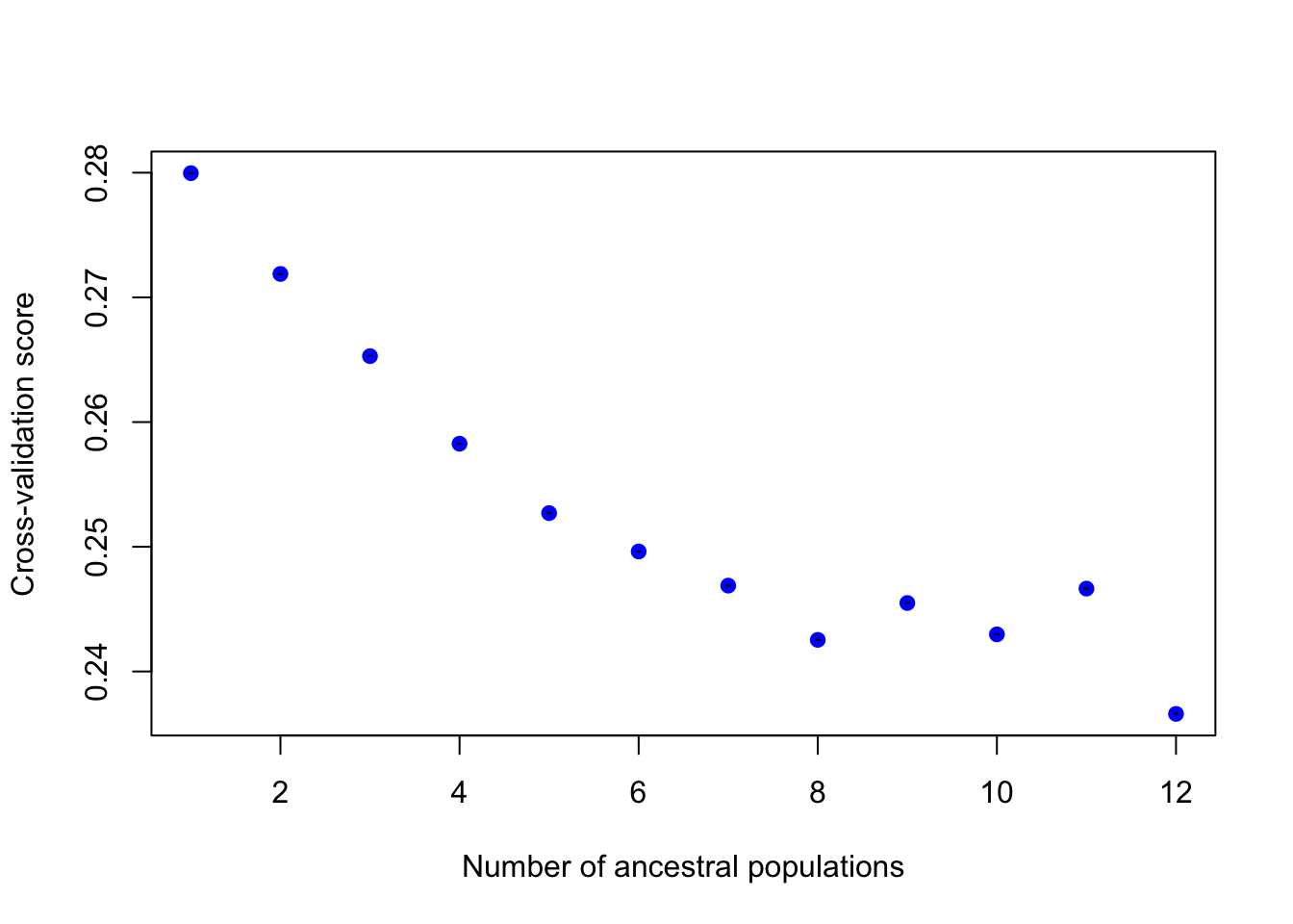
The interpretation of this plot is similar to the cross-validation plot of ADMIXTURE, where cross-validation is based on removing and predicting a fraction of genotypes in the matrix. Smaller values of the cross-validation criterion mean more accurate predictions, and hence better runs. Choosing the best K (number of populations) from different runs of clustering programs such as TESS3 is a widely debated topic, and there might not be one correct answer in many cases (such as in cases of hierarchical structure or IBD). However, the prevailing wisdom is that where cross-validation values plateau or start increasing, K is optimal.
Let’s select a K value of 9, because that seems reasonable. Now we will retrieve a tess3 Q matrix for 9 clusters.
K <- 9
q.matrix <- qmatrix(tess3.obj, K = K)
We can plot a STRUCTURE-like barplot for the Q-matrix.
q.df <- data.frame(pop = data$pop[seq(2,nrow(data),2)],
                   id = data$ind[seq(2,nrow(data),2)])
q.df <- cbind(q.df, q.matrix)
mdat = melt(q.df, id.vars=c("id", "pop"), variable.name="Ancestry",
            value.name="Fraction")
col.pal <- brewer.pal(K,"Paired")
g <- ggplot(mdat, aes(x=id, y=Fraction, fill=Ancestry, order=Ancestry)) +
  geom_bar(stat="identity", position="stack", width=2) +
  facet_grid(. ~ pop, drop=T, space="free", scales="free") +
  xlab("Individual") + ylab("Ancestry Proportion") +
  scale_fill_manual(values=col.pal) +
  theme(axis.text.x=element_blank()) +
  theme(axis.ticks.x=element_blank()) +
  theme(strip.background=element_blank()) +
  theme(strip.text=element_text(size=12, color="black")) +
  theme(legend.position="none") +
  theme(panel.spacing = unit(0.1, "lines"))
print(g)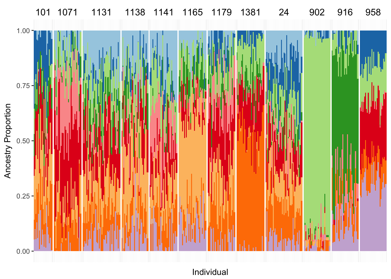
However it would be more useful to see the admixture proportions plotted on a map, which we can do using a custom plotting function.
plotgraph(coordfile, kingsbndry, delsmall, graph, q.df)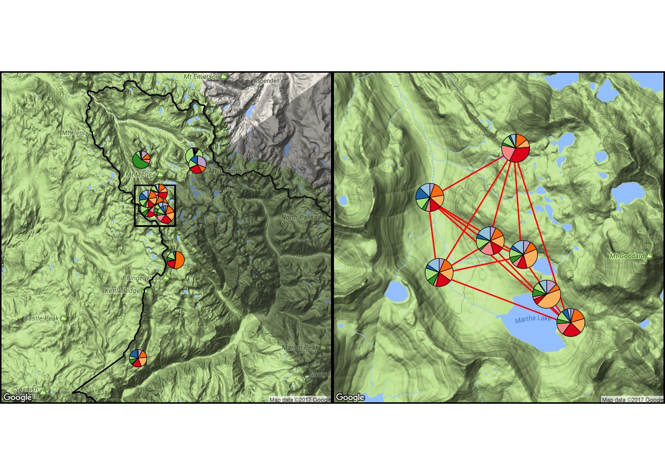
Now let’s repeat all steps for the ddRADseq dataset. Plot root mean-squared errors computed on a subset of loci used for cross-validation.
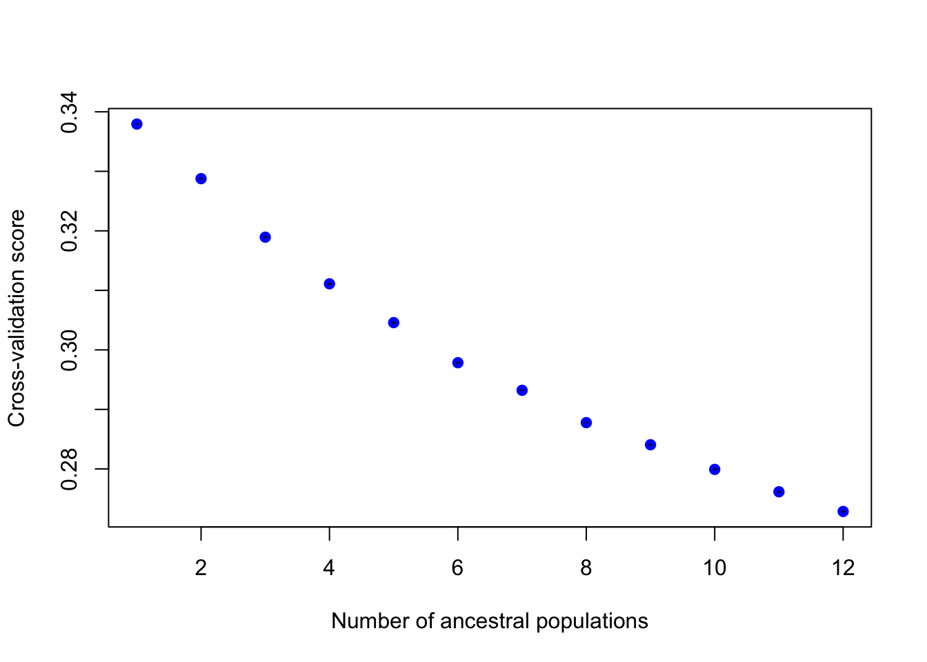
Let’s choose the same K for the sake of comparison. Here’s our STRUCTURE-like barplot for the Q-matrix. 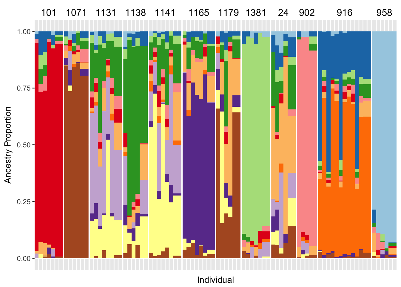
And our map style plotting of the admixture proportions. 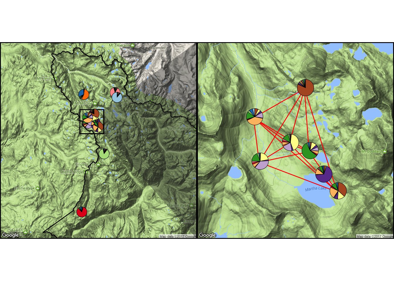
3.3. Discriminant Analysis of Principal Components (DAPC)
Discriminant Analysis of Principal Components (DAPC) analysis is another way of assessing population differentiation. The method was developed as part of the adegenet package, and a tutorial can be found here. DAPC is a multivariate ordination method (as is PCA for example) that is well-suited for relating genetic or genomic data to population boundaries. Unlike PCA, DAPC does not construct variables that maximize variance in the data, but rather constructs variables that maximize variance BETWEEN populations, and MINIMIZE variance within populations. These discriminant functions are linear combinations of allele frequencies, and do not assume HWE or linkage equilibrium as clustering approaches do. DAPC will reliably assign individuals to population boundaries only sofar as those boundaries exist, and enough signal in the data exists. That makes DAPC a useful tool in cases of hierarchical structure or isolation by distance, where multiple definitions of “population” are possible.
Let’s create discriminant functions based on the top 2/3 principal components of the data, and then retain the top 5 discriminant functions based on eigenvalues.
dapc1 <- dapc(gi1, gi1@pop, n.pca=round(nrow(gi1@tab)/1.5), n.da=5)
dapc2 <- dapc(gi2, gi2@pop, n.pca=round(nrow(gi2@tab)/1.5), n.da=5)
Now we can make DAPC biplots for microsatellite and ddRADseq datasets.
par(mfrow=c(1,2)) # Set plotting window for two side-by-side plots
myCol <- rainbow(12)
scatter(dapc1, scree.da=F, bg="white", pch=20, cell=0, cstar=0, col=myCol, solid=.6, cex=3, clab=0, leg=T, txt.leg=c(as.character(unique(gi2$pop))), cleg=0.55, posi.leg="bottomright")
scatter(dapc2, scree.da=F, bg="white", pch=20, cell=0, cstar=0, col=myCol, solid=.6, cex=3,clab=0, leg=T, txt.leg=c(as.character(unique(gi2$pop))), cleg=0.55, posi.leg="bottomright")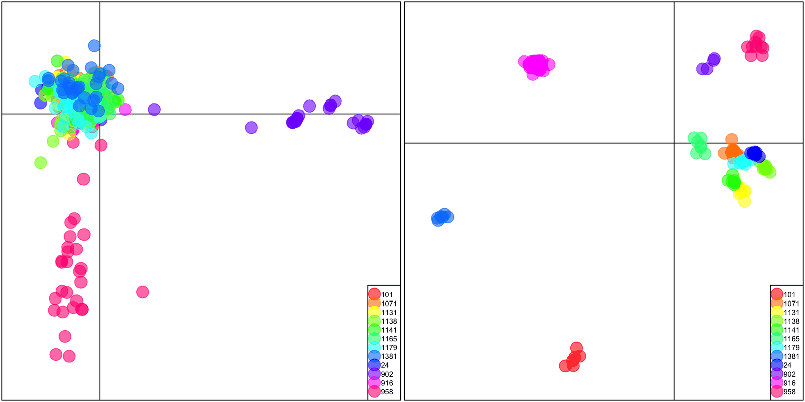
DAPC biplots for microsatellite and ddRADseq datasets.
Discriminant analysis is meant to accurately discriminate between groups of things using predictors, in this case, groups of populations using multivariate ordinations of genotypes. Let’s see how well the microsatellite and ddRADseq datasets perform: accurate predictions of individuals into their populations are along the diagonal.
par(mfrow=c(1,2)) # Set plotting window for two side-by-side plots
table.value(table(dapc1$assign, gi1@pop), col.lab=levels(gi1@pop))
table.value(table(dapc2$assign, gi2@pop), col.lab=levels(gi2@pop))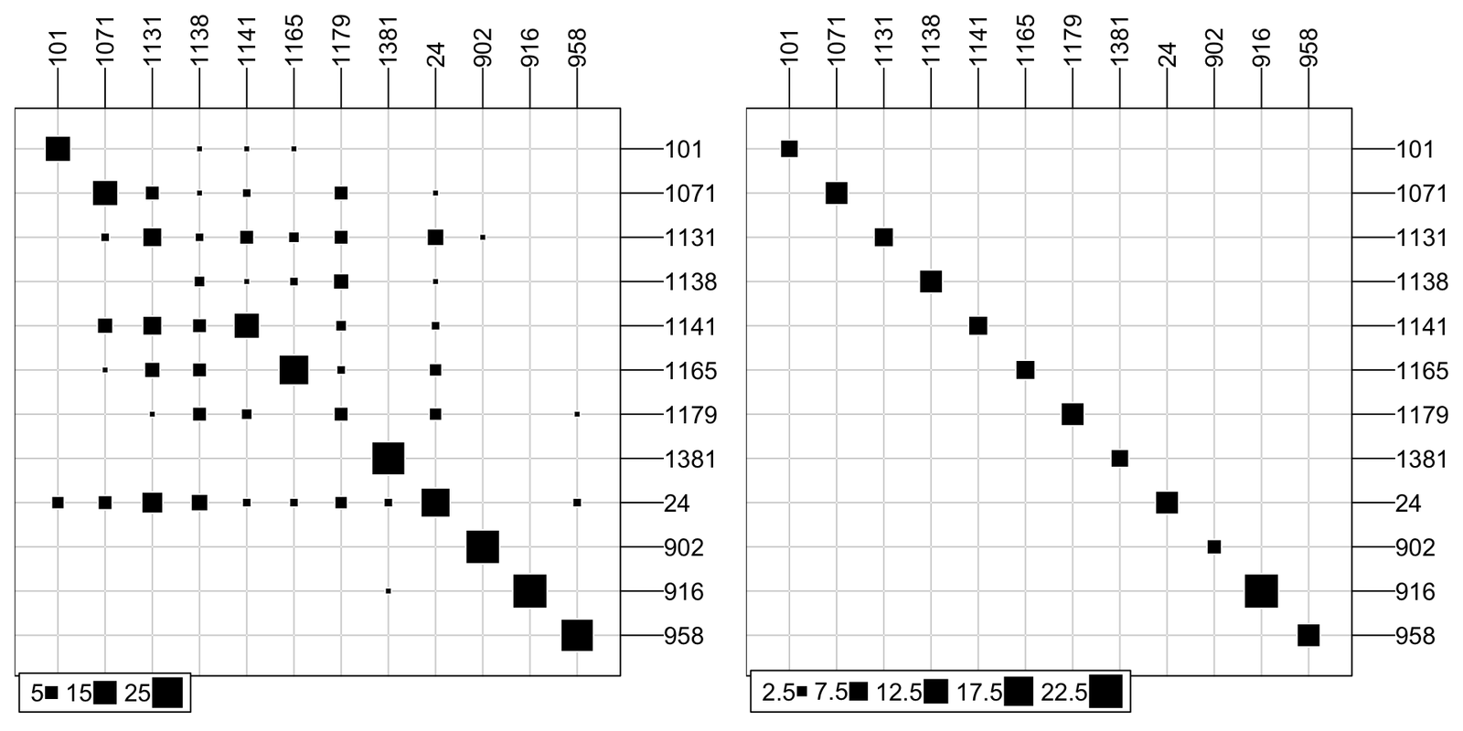
Tables showing accuracy of DAPC prediction for microsatellite and ddRADseq datasets. Columns are predicted populations, and rows are actual populations. Square size represents the number of individuals predicted in that population.
What proportion of individuals are correctly assigned for the microsatellite dataset, for each population and overall?
summary(dapc1)$assign.per.pop## 101 1071 1131 1138 1141 1165 1179
## 0.8000000 0.5333333 0.2195122 0.1034483 0.5333333 0.7333333 0.1666667
## 1381 24 902 916 958
## 0.9000000 0.5250000 0.9655172 1.0000000 0.8965517summary(dapc1)$assign.prop## [1] 0.5940054What proportion of individuals are correctly assigned for the ddRADseq dataset, for each population and overall?
summary(dapc2)$assign.per.pop## 101 1071 1131 1138 1141 1165 1179 1381 24 902 916 958
## 1 1 1 1 1 1 1 1 1 1 1 1summary(dapc2)$assign.prop## [1] 1We can assess the power of ddRADseq halotype loci to correctly assign individuals to populations. All we have to do is randomly sample our 1918 RAD loci and plot the proportion over the number of randomly chosen loci that were used. Let’s also put confidence intervals around our power estimates by trying 10 random draws for each number of loci.
Here is that curve, with the red line showing the assignment ability of our 7 microsatellite loci. It takes roughly 10 RAD loci to match our 7 microsatellites, and we have nearly 2000 RAD loci (which is a conservative number, given the filtering that went into the dataset). With > 60 RAD loci, assignment is near perfect.
thresh <- summary(dapc1)$assign.prop
rad.power <- data.frame(nloc=numeric(0), mean=numeric(0), CIlow=numeric(0), CIhigh=numeric(0))
gi.test.1 <- mono.f(gi2)
for (i in seq(3, 100, 3)) {
  CIreps <- c()
  for (j in 1:10) {
    gi.test.2 <- gi.test.1[,loc=sample(1:length(unique(gi.test.1@loc.fac)), i)]
    dapc.test <- dapc(gi.test.2, gi.test.2@pop, n.pca=round(nrow(gi.test.2@tab)/1.5), n.da=5)
    CIreps <- c(CIreps, summary(dapc.test)$assign.prop)
  }
  assign.mean <- mean(CIreps)
  error <- qt(0.975,df=9)*sd(CIreps)/sqrt(10)
  CIlow <- assign.mean - error
  CIhigh <- assign.mean + error
  rad.power <- rbind(rad.power, c(i, assign.mean, CIlow, CIhigh))
  names(rad.power) <- c("nloc", "mean", "CIlow", "CIhigh")
}

ggplot(rad.power, aes(x=nloc, y=mean)) +
  geom_ribbon(aes(ymin=CIlow, ymax=CIhigh), alpha=0.2) +
  geom_line(aes(y=mean), colour="blue") +
  geom_point(color="black") +
  geom_hline(aes(yintercept = thresh, linetype="a", colour="a")) +
  scale_x_continuous(breaks=c(0, 20, 40, 60, 80, 100)) +
  scale_y_continuous(breaks=c(0.4, 0.6, 0.8, 1.0)) +
  ggtitle("Power of RAD Haplotypes to Discriminate Populations") +
  xlab("Number of RAD Haplotype Loci") + ylab("Proportion of Individuals Correctly Assigned") +
  theme_bw() + theme(plot.title = element_text(hjust = 0.5), legend.position="none")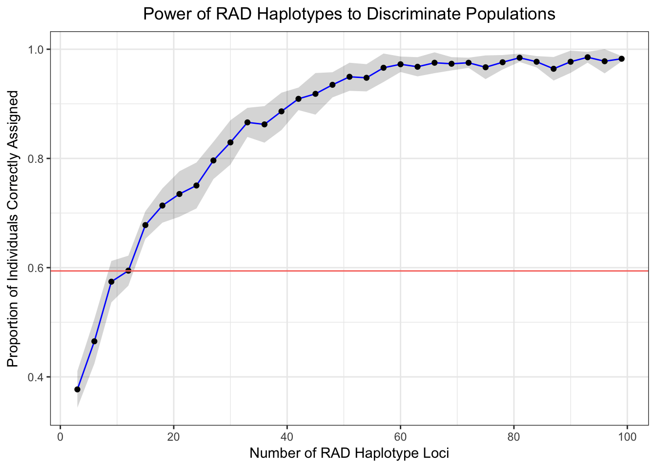
4. Precision of \(\sf{F_{ST}}\) Estimates with Microsatellites vs. ddRADseq
We will use Weir and Cockerham’s (1984) estimate of \(\sf{F_{ST}}\) here to show how precise and accurate estimates of genetic structure are with the two datasets. To use Nei’s (1987) estimate use function fst_NEI87 instead of fst_WC84. See the 2 options using ?fst_NEI87: Nei’s Gst versus Nei’s G’st (prime). G’st has a correction for the bias that stems from sampling a limited number of populations.
We will start with the microsatellite dataset.
First we estimate Weir and Cockerham (1984) \(\sf{F_{ST}}\) for diploid genomes, with 100 bootstraps across loci.
data.fst.1 <- genind2df(gi1)
data.fst.1 <- data.frame(INDIVIDUALS=row.names(gi1@tab), POP_ID=data.fst.1$pop, data.fst.1)
fst.ci.1 <- fst_WC84(data = data.fst.1, pairwise = T, ci = T, iteration.ci = 100, quantiles.ci = c(0.025, 0.975), digi1ts = 6, verbose = T)
## #######################################################################
## ######################### assigner::fst_WC84 ##########################
## ######################################################################### Fst computations with assigner built-in function## Importing data## Computing global fst## Computing paiwise fst## ############################### RESULTS ################################# Fst (overall): 0.205144784 [0.153253319 - 0.280681155]## Computation time: 34 sec## #######################################################################Let’s view the content of fst.ci.1. There are many objects in this list, including variance components of \(\sf{F_{ST}}\), as well as \(\sf{F_{ST}}\) overall, by locus, pairwise between populations, and pairwise with confidence intervals from 100 bootstrap samples. (\(\sf{F_{IS}}\) is also available, but we will not be using that here).
names(fst.ci.1)## [1] "sigma.loc" "fst.markers"
## [3] "fst.ranked" "fst.overall"
## [5] "fis.markers" "fis.overall"
## [7] "fst.plot" "pairwise.fst"
## [9] "pairwise.fst.upper.matrix" "pairwise.fst.full.matrix"
## [11] "pairwise.fst.ci.matrix"We will build a pairwise \(\sf{F_{ST}}\) data frame with bootstrapped confidence intervals.
df1 <- fst.ci.1$pairwise.fst
contrast <- paste(df1$POP1, "-", df1$POP2)
df1 <- data.frame(CONTRAST=contrast, df1)
Let’s save a plot of the distribution of overall \(\sf{F_{ST}}\) values.
f1 <- fst.ci.1$fst.plot + ggtitle(bquote('Distribution of F'[ST]~ 'Across Loci: Microsatellites')) +
  xlab(expression(paste(F [ST]))) + ylab("Count") +
  theme(plot.title = element_text(hjust = 0.5))
Now order by mean \(\sf{F_{ST}}\) value for plotting.
fst.data.1 <- df1[order(df1$FST),]
fst.data.1$CONTRAST <- factor(fst.data.1$CONTRAST, levels=fst.data.1$CONTRAST)
g1 <- ggplot(fst.data.1, aes(x = as.factor(CONTRAST), y=FST)) + geom_point() +
  geom_errorbar(aes(ymin=CI_LOW,ymax=CI_HIGH), width=0.5) +
  ggtitle("Pairwise Genetic Differentiation Estimates: Microsatellites") +
  xlab("Contrast") + ylab(expression(paste(F [ST]))) + theme_bw() +
  theme(axis.text.x = element_text(angle = 45, hjust = 1),
        plot.title = element_text(hjust = 0.5))
Now we just have to repeat all steps for the ddRADseq dataset, and then we can plot our comparisons. First: let’s look at pairwise \(\sf{F_{ST}}\) between pairwise sets of populations:
multiplot(g1, g2, cols=1)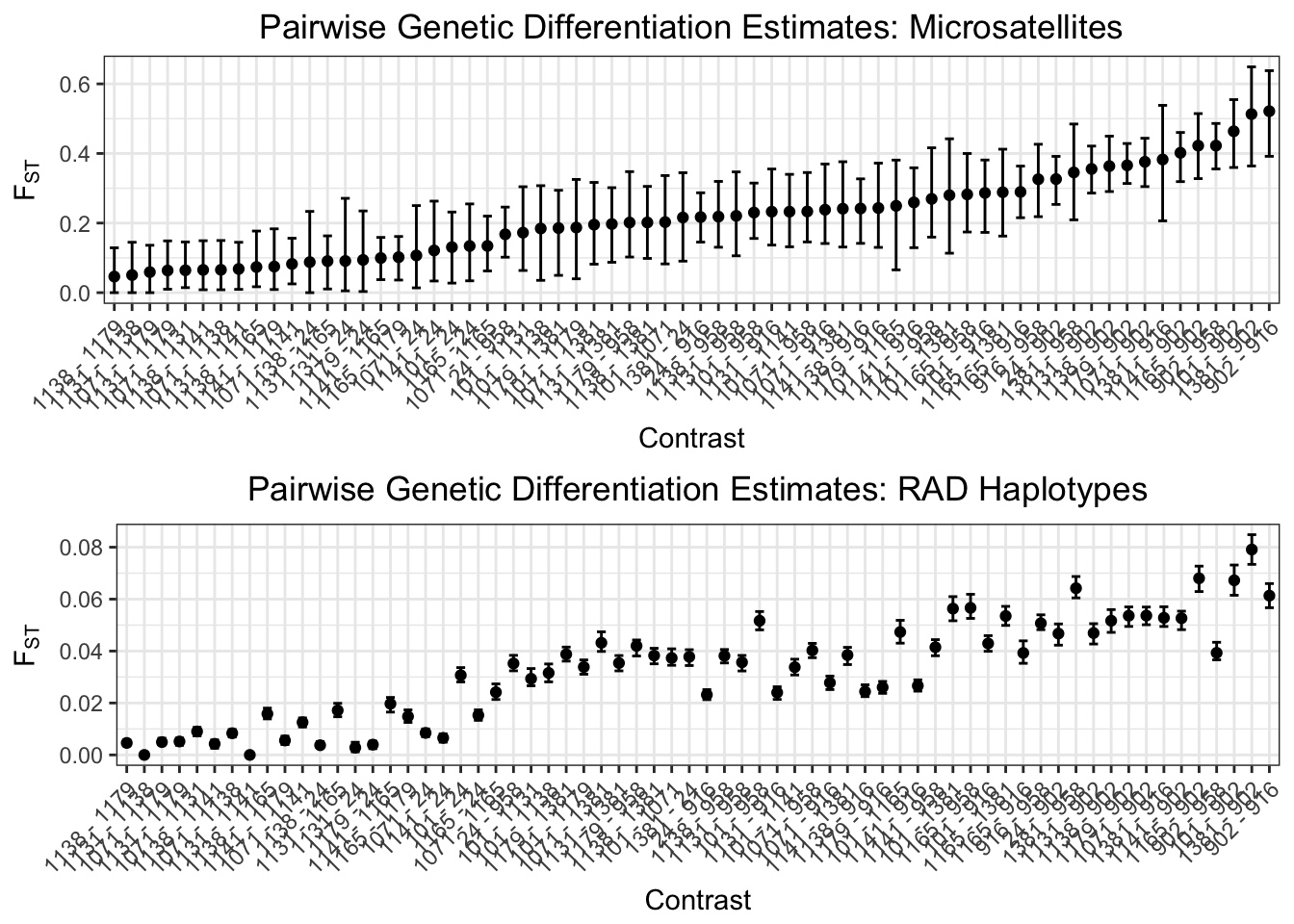
Second: let’s see overall \(\sf{F_{ST}}\) across loci in these two datasets:
multiplot(f1, f2, cols=1)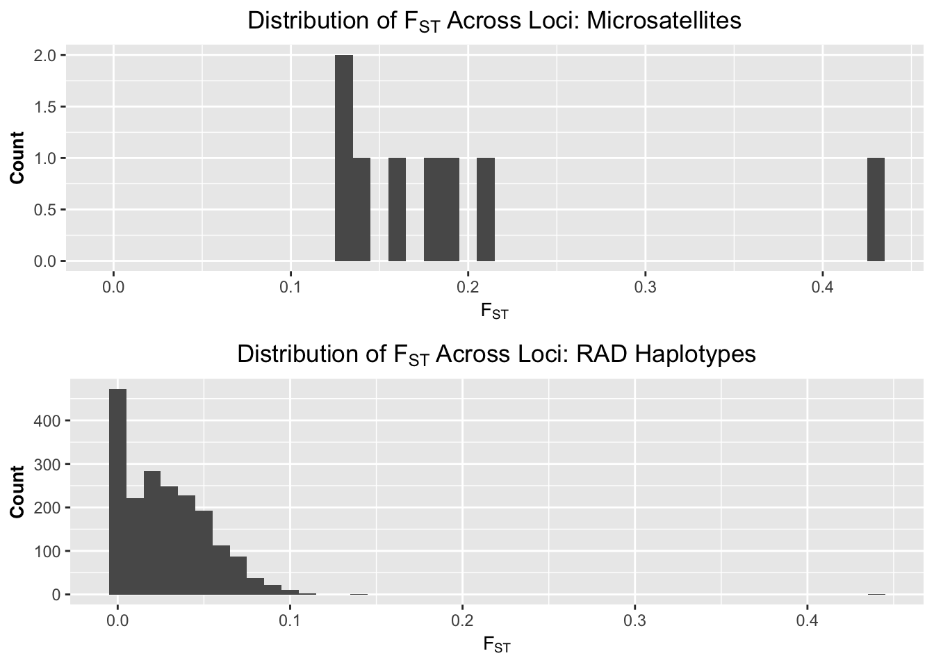
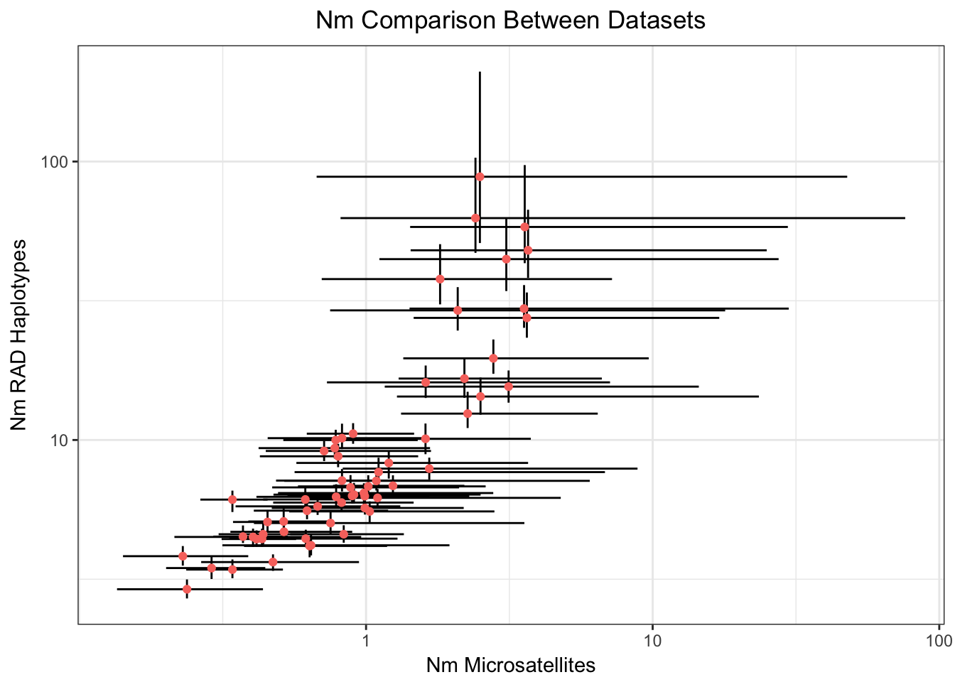
Third, let’s see scatterplots of \(\sf{F_{ST}}\) and number of migrants among the datasets, with confidence intervals. This should give us a sense of the relative precision and accuracy of both. Note that estimating the number of migrants (Nm) directly from an estimate of genetic structure such as \(\sf{F_{ST}}\) is laden with assumptions about Wright’s island model. Whitlock and McCauley (1999) review the reasons we shouldn’t infer Nm this way. However the relative values should still give us a sense of how precise (confidence interval bars) and accurate (difference in values and correlation) estimates of Nm might be if estimated by other methods.
both <- merge(fst.data.1[,c("CONTRAST","FST","CI_LOW","CI_HIGH")],
        fst.data.2[,c("CONTRAST","FST","CI_LOW","CI_HIGH")], by="CONTRAST")

ggplot(both, aes(x=FST.x, y=FST.y)) +
  geom_errorbar(aes(ymin=CI_LOW.y, ymax=CI_HIGH.y)) +
  geom_errorbarh(aes(xmin=CI_LOW.x, xmax=CI_HIGH.x)) +
  geom_point(aes(color="red")) +
  ggtitle(bquote('F'[ST]~ 'Comparison Between Datasets')) +
  xlab(bquote('F'[ST]~ 'Microsatellites')) + ylab(bquote('F'[ST]~ 'RAD Haplotypes')) +
  theme_bw() + theme(plot.title = element_text(hjust = 0.5), legend.position="none")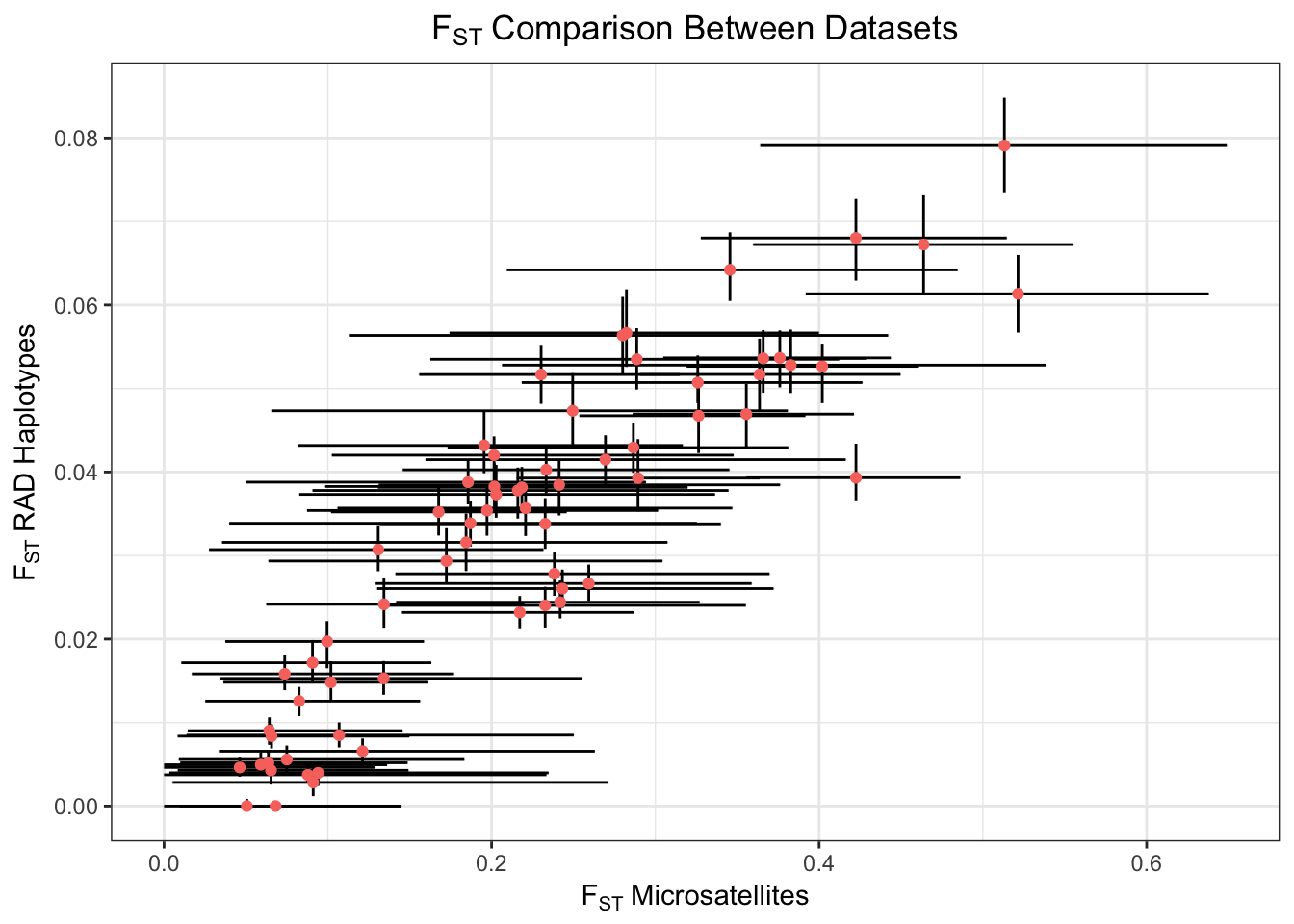
row_sub <- apply(both[,-1], 1, function(x) { all(x!=0) } )
both <- both[row_sub,]
both[,-1] <- (1 - both[,-1]) / (4*both[,-1])
names(both) <- gsub("FST", "NM", names(both))

ggplot(both, aes(x=NM.x, y=NM.y)) +
  geom_errorbar(aes(ymin=CI_HIGH.y, ymax=CI_LOW.y)) +
  geom_errorbarh(aes(xmin=CI_HIGH.x, xmax=CI_LOW.x)) +
  geom_point(aes(color="red")) +
  scale_x_log10(breaks = c(1, 10, 100, 1000)) +
  scale_y_log10(breaks = c(10, 100)) +
  ggtitle("Nm Comparison Between Datasets") +
  xlab("Nm Microsatellites") + ylab("Nm RAD Haplotypes") +
  theme_bw() + theme(plot.title = element_text(hjust = 0.5), legend.position="none")